In my last blog post I presented how I was able to create new resources to transform a regular music class routine (chair test) into a more meaningful activity for my students. Besides performing the required music excerpt for their test, they were also engaged in the analysis and evaluation of their peers as well. Not only does this support our school wide tier 2 academic vocabulary words, but also requires my students to listen and evaluate using musical tier 3 academic vocabulary concepts such as Tone, Pitch, Rhythm, etc.
Academic vocabulary (AV) is the vehicle for our school wide project. We measure its usage within our assignments to compare and hopefully find instances of positive deviance within our instructional practices. This has required me to get creative and develop new forms of assessment to measure my students use of AV in their academic writing. Whereas this kind of activity is common in the core subjects, it's not quite the typical activity found within the instrumental music class. My students have already completed one writing assessment this year, and I recently had to come up with a new assessment, different from the first, to measure my students' AV use.
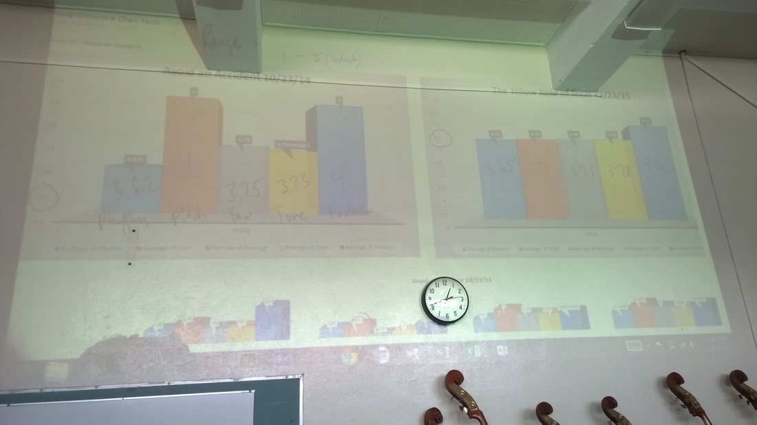
My students recently completed another chair test, and I found myself looking at two sets of data points. The scores from their first chair test, and the scores from the recent chair test. The scores are based on a rubric I previously created, which accounts for the correct Pitch, Rhythm, Tone, Bowings, and Posture of their performance. The data is great for me to analyze, but what would my students think after seeing it too? I decided to find out.
Within the Excel file containing all my score data, I exported the numbers from both chair tests into two separate pivot tables. Using the pivot tables, I was able to average the rubric's category scores and show how my students' performed as a class and also as a section.
After my pivot tables were set up, I turned the data into charts with a couple of mouse clicks. I formatted the chart to make it look nice and simple for my students. After the charts were done, I exported (copy/paste) them to a Word doc, typed up the assignment directions, and Voilà! A new writing assignment. My students had to compare both sets of scores and look for changes among the rubric categories. Then they had to analyze both chair test exercises and use them to explain the changes that occurred in their score averages.
Seeing the differences in their scores was a pretty easy task, but explaining the changes by analyzing and citing specific challenges that each song presented…that was going to be a challenge for them >:-)
I gave them two days, and overall was pleased with the results of my students first attempt at this. Citing the data was not an issue, and most of them were able to dig a little deeper into the music and specifically identify and compare the technical challenges from both songs. Pretty cool. I love making my students think :-)
Below are some examples of what I received in their essays. Some are exactly what I'm looking for, and some are just fun to read :-)
Scroll to the right --->
Below are some examples of what I received in their essays. Some are exactly what I'm looking for, and some are just fun to read :-)
Scroll to the right --->
I've been collecting this data for years, and by using Excel's pivot tables I was able to create a meaningful writing assignment for my students. An assignment requiring the analysis of music and data, plus synthesizing and justifying their findings into a written essay.


 RSS Feed
